Introduction to Statistics
Statistics is a branch of mathematics consisting of collecting, organzing, analyzing and interpreting observations, which are referred to as data.
Large amounts of data are very difficult to interpret without doing some form of statistical analysis to it first.
That is one of the main purposes of statistics: to turn cumbersone and confusing data into clear and concise measures or illustrations.
Introductory Example 1
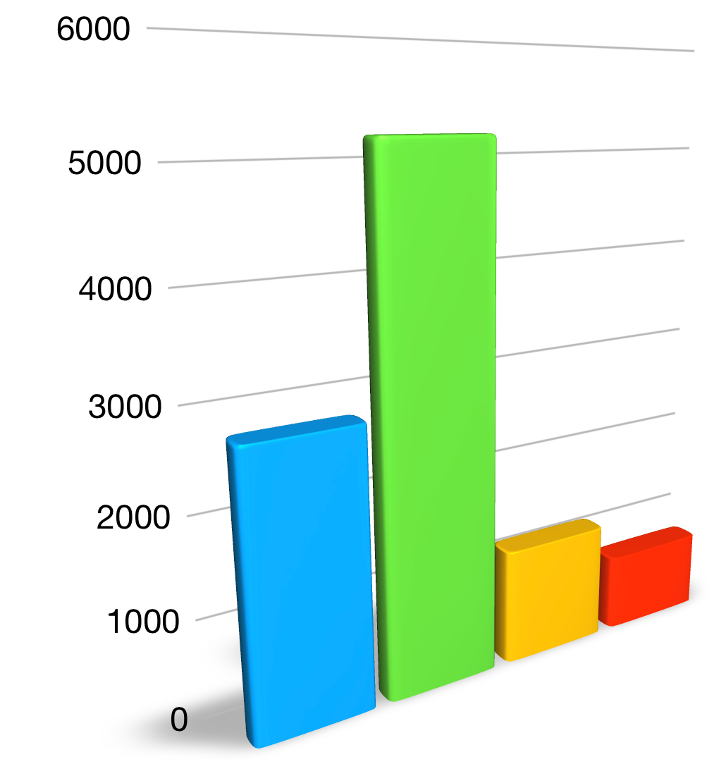
To illustrate this: imagine if \(10,000\) thousand people were asked which color they prefered between blue, green, red and yellow.
Collecting Data
If we had to do this by hand, we would keep a tally of the colors people prefer using a tally chart.
Otherwise we could send an online survey to collect \(10,000\) people's preferred color.
That would lead to a lot of data to read through; pages and pages with nothing but the colors blue, green, red and yellow written on them.
Interpreting this data without any form of processing would be difficult.
That's where statistics is useful:
After just a bit of organisation in which we count the number of times each color was preferred, we can quite easily summarize all of the data in an illustration, like the bar chart we see here.
Despite how simple this is, it is a very useful tool.
All it takes for us to get a good idea of the preferences of \(10,000\) people is a quick look at the bar chart; \(10,000\) bits of data summarized and easily analyzed in just a quick look.
That is what statistics is all about: being able to sumarize data/information (some times tremendously large amounts of it) with "easy to read and approach" illustrations and values.
Introductory Example 2
A small class of \(8\) students sits a geography test. The test is graded out of \(10\) and the results obtained were: \[9, \ 6, \ 3, \ 8, \ 8, \ 5, \ 10\] These numbers (grades) show us how well each individual student did at the test but we may be interested in answering the question:
The Mean Value
The mean \(\bar{x}\), of a set of data, is commonly thought of as the average, and is calculated using the formula: \[\small{\bar{x} = \frac{\text{Sum of the Values}}{\text{Number of Values}}}\]
Despite the fact that this measure is useful, statistics provide us with many other measures that we'll soon be learning, that provide us with additional information about how well the class did at the test.
Although we don't know how to calculate/find these yet, here are some of the measures we could use for this data:
- The range, which is \(7\) for this test, and measures how dispersed the grades are. A range of \(7\) (at a test graded out of \(10\)) could mean that there are some students of very different ability in the subject in the same class.
- The median, which is \(7.5\) here, tells us that \(50\%\) of the students obtained a grade greater that \(7.5\).
- The lower quartile, which is \(5.5\) here, tells us that \(75\%\) of the students scored above \(5.5\).
- The upper quartile, which is \(8.5\), tells us that \(25\%\) of the students scored above \(8.5\).
- The standard deviation, which is \(2.1\), tells us that, on average, students' grades were \(2.1\) marks away from the "class average" of \(7\).
The same measures/teachniques would be used if we looked at the grades of \(10,000\) students (for example when students world-wide sit the SAT, A Levels, the IB, ... ).
This shows us that statistics allows us to go from a, sometimes large, bulk of data to clear and concise numerical, or graphical, measures that can easily be interpreted and communicated.
Before Learning Formula & Techniques: Know Your Data
Before learning how to illustrate data with graphs and how to calculate statistical measures, we need to learn about the different types of data we'll work with in statistics.
Depending on the type of data we have, the statistical tools we can use will sometimes vary.
For instance we won't analyze the various eye colours of a population the same way that we would study the height of each person in that population.
Indeed eye color is a qualitative measure (blue, green, brown, ... ) whereas height is a numerical measure (a number). These two types of data are treated differently.
Data can be of two types:
Furthermore, there is more than one type of quantitative data, there are two, namely: discrete data and continuous data.
Knowing how to distinguish different types of data is the "starting point" to our course in statistics.
Click on the link/button, below, to start learning about the different types of data.